
Analytics Dashboard
The Analytics dashboard provides visual insights into your survey responses. View charts, statistics, and trends to understand your data at a glance.
Accessing Analytics
- Open your survey
- Click the “Analytics” tab in the top navigation
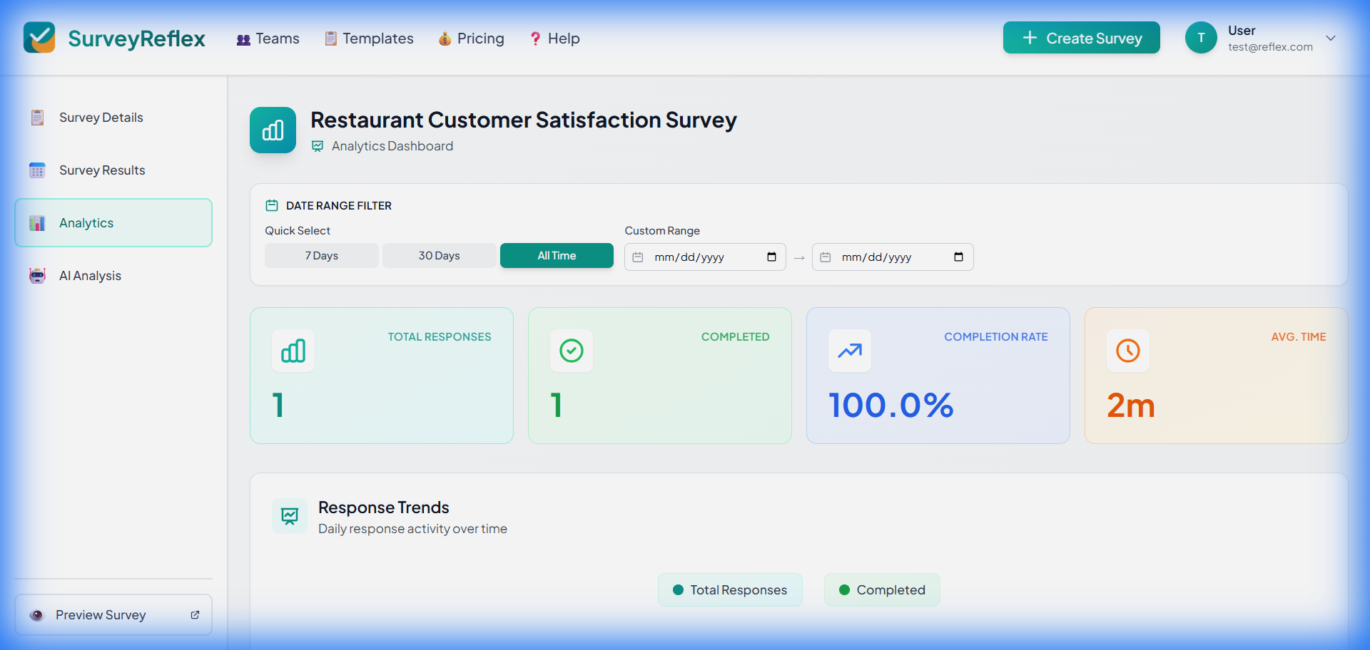 Access the Analytics tab
Dashboard Overview
The Analytics dashboard includes:
- Summary metrics
- Response trends
- Question-by-question breakdown
- Device analytics
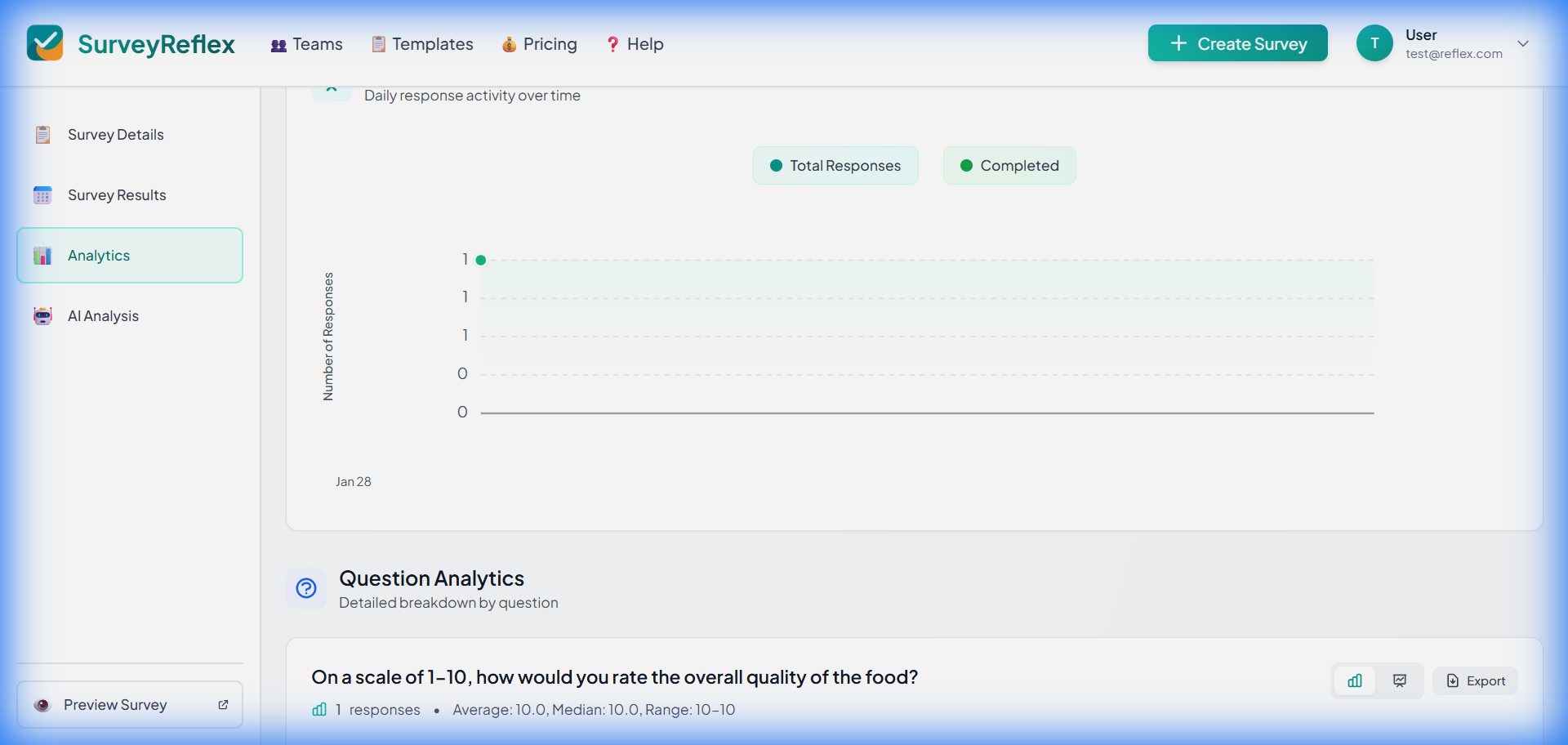 Analytics dashboard overview
Summary Metrics
At the top of the dashboard:
Key Statistics
| Metric | Description |
|---|---|
| Responses | Completed responses |
| Abandoned | Started but never finished |
| Completion Rate | Completed as a share of everyone who started |
| Avg. Completion Time | Average time to finish |
| Response Rate | Responses per day (average) |
Every chart and metric on this page is based on completed responses only. Abandoned attempts are counted so you can see your drop-off, but their answers never appear in a breakdown. To read them, use the “Include partial” option on the Results page.
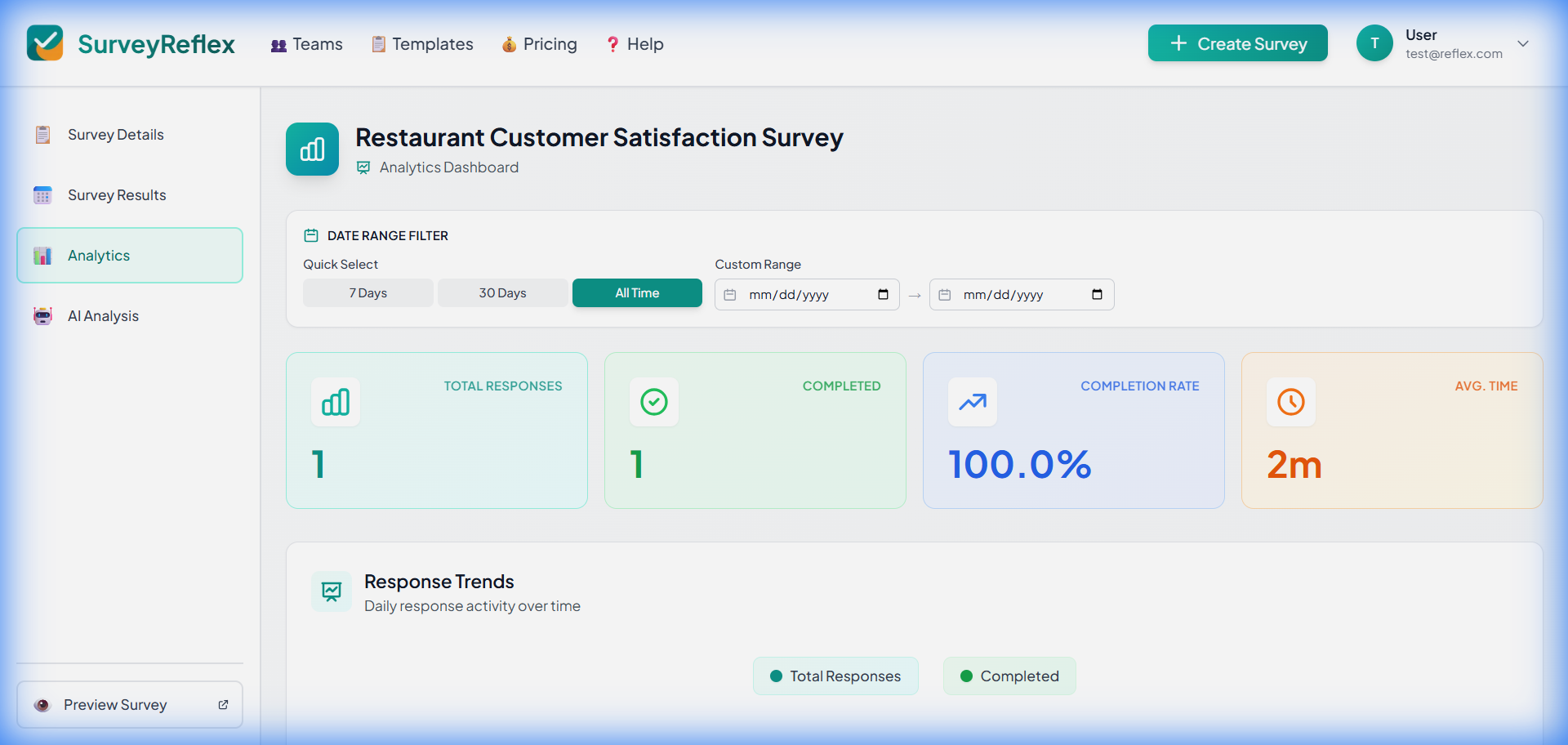 Key metrics at a glance
Response Trends
Responses Over Time
Line chart showing:
- Daily response count
- Trend over survey lifetime
- Identify peak response times
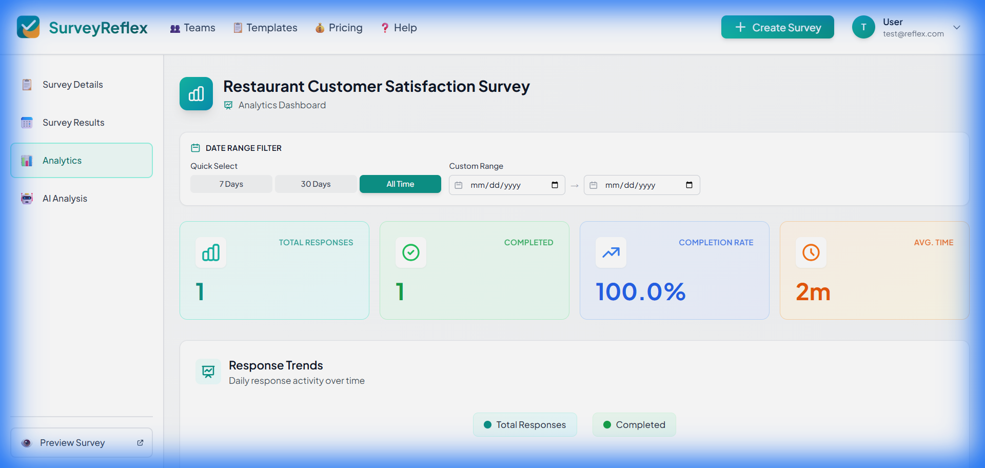 Response trend over time
Using Trend Data
- Identify best sharing times
- Spot collection patterns
- Plan reminder emails
Question Analytics
Each question has its own analytics section.
Choice Questions
For Multiple Choice, Yes/No, and Dropdown questions:
Pie Chart
- Visual distribution of answers
- Percentage for each option
- Color-coded segments
Bar Chart
- Count for each option
- Easy comparison
- Sorted by frequency
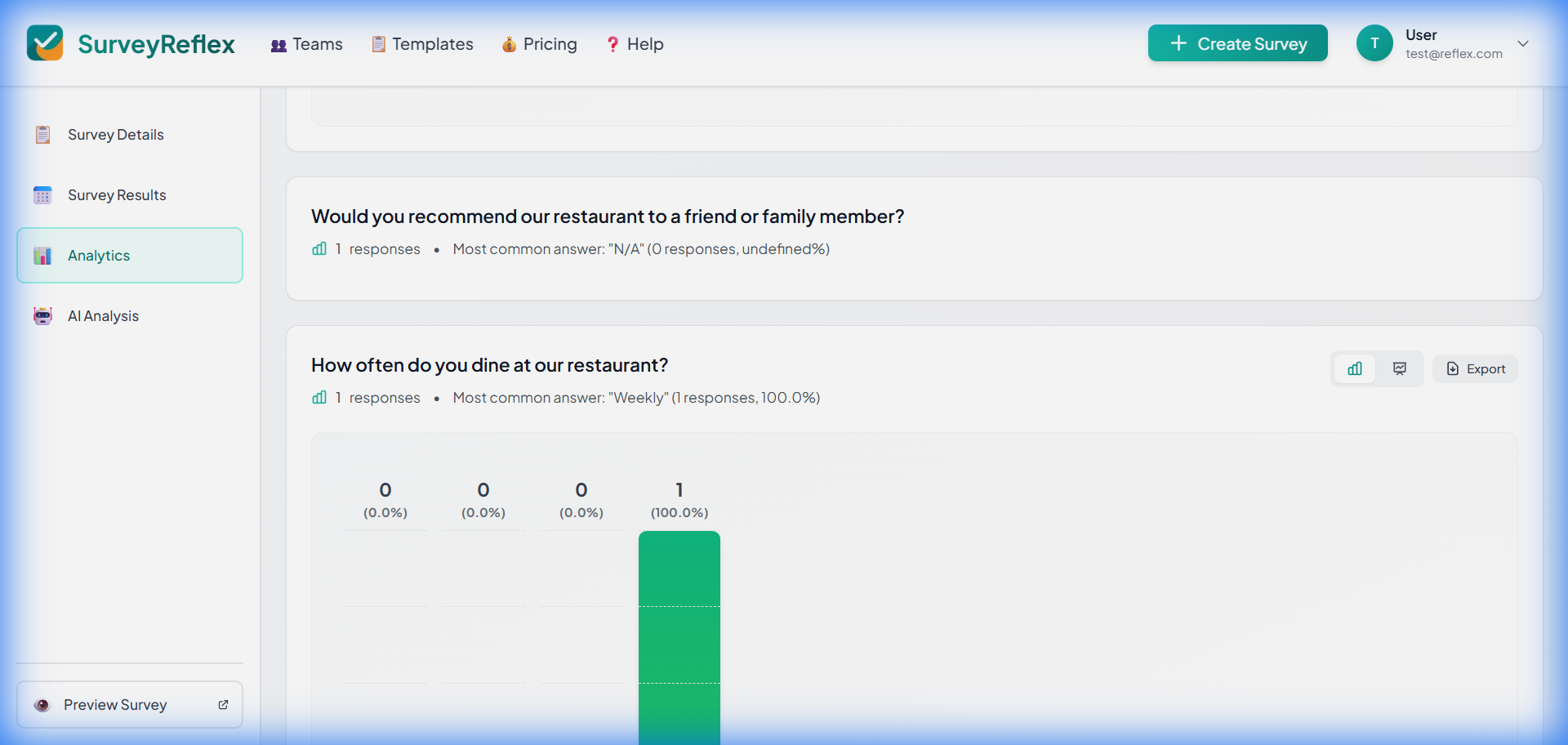 Pie and bar charts for choice questions
Rating Questions
For Star Rating, Numeric Rating, and Opinion Scale questions:
Distribution Chart
- Bar chart of rating values
- Average rating displayed
- See spread of responses
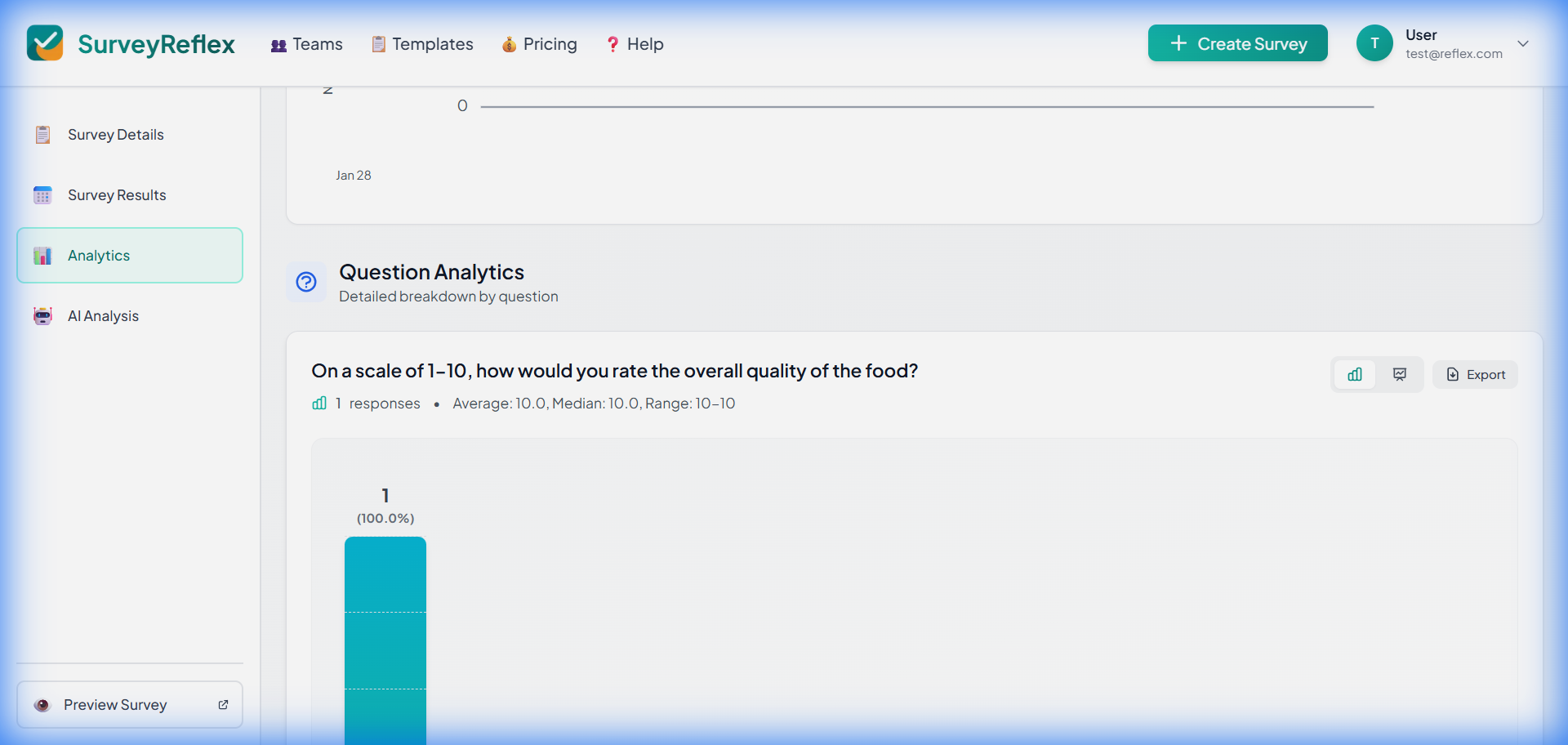 Rating distribution chart
NPS Questions
Net Promoter Score questions get a dedicated score panel:
- Your computed NPS (from −100 to +100) with a rating band (e.g., “Good”, “Excellent”)
- A segment bar showing detractors (0–6), passives (7–8), and promoters (9–10)
- The full 0–10 score distribution chart below
The score is calculated as % promoters − % detractors and updates automatically as responses arrive.
Ranking Questions
For Ranking questions:
- Items are sorted by their average rank across all responses (best first)
- You also see the share of respondents who ranked each item first
- A lower average rank means the item is more preferred
Text Questions
For Short Text and Long Text questions:
Word Cloud
- Shows the terms people mention most across all answers
- Larger words appear in more answers — size reflects how many people used a term, so one long answer repeating a word cannot inflate it
- Common filler words (“the”, “and”, “very”) are excluded automatically, and email addresses, links and phone numbers are stripped out before counting
- Singular and plural forms count as one term (“product” and “products”)
- Click any word to filter the answers below to just those mentioning it, with the term highlighted; click it again, or the chip, to clear
- Switch to Ranked terms for the exact count behind each word
The word cloud appears once a question has at least 5 text answers. Below that, the latest answers are simply listed.
Response Count
- Number of text responses, plus the average answer length
- Full answers are listed under the cloud, and in the Results tab
Matrix Questions
For Matrix Rating questions:
Heatmap or Table
- Row-by-column breakdown
- Color intensity shows frequency
- Easy pattern identification
Device Analytics
Understand how respondents access your survey:
Device Breakdown
Pie chart showing:
- Desktop - Computer/laptop
- Mobile - Smartphones
- Tablet - iPad and similar devices
The device is detected automatically from each respondent’s browser — they are never asked. Older responses may show Unknown if no browser information was recorded when they were collected.
Why Device Data Matters
- Optimize for dominant device
- Check mobile experience if high mobile usage
- Identify accessibility issues
Date Range Filter
Filter analytics by time period:
- Click the date range selector
- Choose preset or custom range
- All charts update automatically
Available Presets
- Last 7 days
- Last 30 days
- This month
- All time
- Custom range
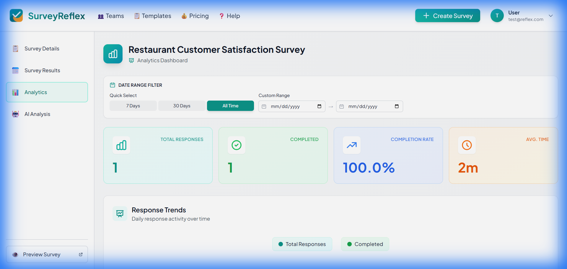 Filter analytics by date
Interpreting Analytics
Completion Rate
Good: 70% or higher Average: 50-70% Low: Below 50%
Low completion rates might indicate:
- Survey is too long
- Questions are confusing
- Technical issues
Response Distribution
For choice questions:
- Even distribution suggests diverse opinions
- Skewed distribution shows strong preference
- Empty options might need removal
Average Ratings
For rating questions:
- Compare to your benchmarks
- Track changes over time
- Identify areas for improvement
Exporting Analytics
Save your analytics data:
- Click “Export” button
- Choose format (PDF recommended for charts)
- Download the report
See Exporting Data for more details.